My Music Video

My Website

Wednesday, October 30, 2019

Blog Post 11: Closing Post

Dear Moderator,

I wish you a warm welcome to my Media AL NEA blog. On the right as well as at the bottom of this post, there is a label called "AL Research and Planning", in which you will find the 10 blog posts for my NEA.

Emmanuel Li (3113)

This blog is now closed.

Blog Post 10: My Production Review

I was very pleased to receive generally positive feedback from my teachers and peers throughout the course of my project. They responded well to the "retro, striking and stylish" mood board and pitch for my star persona, and the idea for a colourful and vibrant yet emotionally dark music video narrative was also well-received.

Initially, there were even more plot strands in the narrative, for example, one including a posse of friends whom the protagonist abandons in favour of the manipulative girlfriend, only to return to them after the breakup and they welcome him back with a big, confetti-filled party. After discussions with my teacher, I decided to cut this sub-plot as it didn't fit as well with the individuality aspect of the message, but also due to logistical reasons. So I ended up only using 3 actors and characters in the video.

During post-production, a lot changed in terms of where I imagined the episodic narrative sections, as well as the abstract conceptual sections, would play into the video in relation to the performance bed, however this was very much a change for the better, as I managed to find a balance and flow between the three. One point of change recommended by my teacher was to include more than just one shot of me dancing in front of a 'Violet Sky', which I was lucky enough to catch at a Luxembourg service station at 5am in the morning. This was in order for it to not be as jarring of an addition, as the rest of the video is either set in the studio or Central London.


With the website, my teachers and peers liked the colours, design and overall 'look and feel' of it, as well as its professionalism. My teachers asked that I made my linked page clearer, to include more social contexts such as charities, and to create more of a fan presence. Therefore I made the about page more prominent in the menu bar, created a strip about my star's commitment to Earth Alliance, and added a Q and A feature. I also anchored my menu bar to always be present at the side of the page, to make navigation easier.

Overall I'm very happy and even surprised by how this project turned out. It was full-on and intense, and involved so many disciplines (photography, filmmaking, editing, photo editing, website design etc.) but I've had an immensely enjoyable and educational time.

Blog Post 9: My Website and Social Media Pages

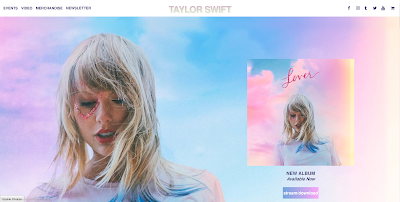
As we've discovered in Blog Post 2, a pop artist's online presence is crucial to their success and brand. Taylor Swift's online, social and participatory presence is especially synergised with a clear and distinct brand. It adheres to all the pop artist website conventions:
- A focal image of the artist on the front page
- Most of the content is on the front page, which viewers scroll down to access
- Merch and tour tickets are heavily promoted
- A colour palette that matches the current album being promoted

Front page of the website. Clear pastel colour palette with a large focal
image and promotion for the new album
Synergy of colour palette carried on further down the page.
Merch for both the new album and the artist herself
Taylor's Instagram. Profile pic is the album cover. Highlights
promote the new album as well as the songs in it. Picture of
Taylor caressing cat adds to star person

Taylor's star persona is conveyed through all the platforms - caring, gentle and beautiful. The products are also equally promoted online and merch exclusive to the online store creates a sense of community and fandom.

I have used similar concepts in my own artist's online presence:

Bright and distinct colour palette and "feel". Digital convergence: Sony Music
linked in top corner. Social Links under menu bar and Artist Logo.
Embedded Spotify player of the new single

Vinyl LPs have been on a comeback in recent years and fit with my artist's "retro" aesthetic


Instagram posts consist of a lot of stills from
the music video - convergence

My star persona is bright, vibrant and colourful, with a colour palette of blue, yellow and pink prevalent throughout the website. The music video is promoted on the Instagram through the posts of stills, and the merchandise store offers exclusive deals on products that feature both the artist and new album.


Having a synergised and strong online presence creates a consistent image for the star, giving fans a sense of familiarity, and in turn generating more engagement and sales of merchandise, physical copies of the album as well as tour tickets.

Blog Post 8: My Music Video

Music videos are quite a postmodern form of video, created with a goal to add a visual dimension to a piece of music, which creates more interest and "buzz" around the song, as well as providing a chance for the star to present themselves visually and perform. This leads on to increased sales in the song, album and tour tickets. According to Goodwin music videos work around 3 codes - music, lyrics and iconography, that are designed to provide pleasure in order to keep the viewer watching and to encourage repeat viewings. Conventionally, in music videos:
- Visuals illustrate, amplify or offer disjuncture with the lyrics in order to provide an extra layer of meaning.
- Editing may match the phrases or be cut to the beat, and can also be in disjuncture (lack of continuity, cutting between extremes, breaking conventional editing rules)
- The narrative is not always complete and may be fragmented or leave a lot up to interpretation

For 'Grace Kelly', I want to create a music video that, amplifying the lyrics, would be colourful and vibrant, however in disjuncture to the Pixar-like, Anderson-esque visuals and upbeat music (but still interpreting the lyrics of the song) would deal with a quite serious and painful matter - a toxic relationship. 
This is inspired by the music video for Benny Sings' song 'Not Enough':

The video features a large variety of pleasantly warm and
colourful mise-en-scenes, though the actual imagery depicted
is quite dark and surreal

The contorted way characters act contrast with the
environment and world of the video, contributing to an
interesting and twisted diegesis
The music video opens with the protagonist (played by the
singer) making a call. I intend to open my video in a similar way
The narrative of my video will revolve around the protagonist, Vince (played by my star persona), calling up Cindy, his manipulative and domineering girlfriend, in order to break up with her, as he is tired of constantly changing himself. This break up call will bookend the video and everything in between is implied to be a metaphorical or literal representation of what is talked about on the call; We'll see flashback snippets (Vernallis' fragmented narratives) of dates gone sour, eventually leading to a midpoint twist in which Vince discovers Cindy is cheating on him.
We then move to an abstract 'audition' sequence, in which Cindy and her new boyfriend are suited and seated at a table while Vince auditions for them, jump-cutting between different costumes representing different personalities - none of which satisfy Cindy, who crosses him off in her long list of auditionees/boyfriends. To symbolise the break up, Vince strides over to her desk and rips up her audition sheet in her face.
The moodboard/visual timeline I put together for my music video

Throughout this narrative then conceptual story will be performance sections intercut in. The performance will be bold, boisterous and energetic, Vince expressing a euphoric and feisty joy in cutting off the controlling Cindy from his life. His individuality and eclectic personality will also be presented in a conceptual way through a split-screen towards the end, showing three Vinces performing all the parts of a band.

The end of the video will show Cindy's world fading to black and white, which utilises the music video convention of extremes, as well as evoking the genre of film noir. It also acts as a visual metaphor that she has lost Vince's colourful personality, which she never appreciated in the first place.

My music video will create representations of a vulnerable male character who learns to love himself for who he is, rather than having to conform to someone else's preferred view of him. It will also present a strong female villain character, connoted through her red dress and lipstick, classic signifiers of danger, while also bringing to mind the tough femme fatale characters of noir cinema.

Blog Post 7: My Pop Artist or Band

A pop artist's star persona often complements or contrasts their music in ways that engage and interest audiences. Their 'offstage personality' also contributes to their overall image - fans often see this side of artists through their personal social media pages. Two artists that I looked at to research this are Lewis Capaldi and Rex Orange County:


Lewis Capaldi's music and website is moody and serious in tone
(Dark colour palette. Blood-red wash over focal image. His huddled position
and grave expression). His songs are known for having big 
vocal moments of emotional outpourings.

Capaldi's Instagram on the other hand is
quite down-to-earth, posting home-videos,
pics with friends, updates to fans etc.

Lewis Capaldi's star persona and his 'real' personality contrast greatly. Outside of his music, he is presented as a hugely likeable and most importantly funny guy. He often posts unflattering photos of himself, wears silly costumes, makes jokes about himself being fat during live shows, and carries a very carefree demeanour about himself. This is very disarming for audiences and makes the emotional moments of his music hit that much harder when fans see and hear the usually smiley and jokey Capaldi 'get serious' and express his troubles and pains in his music.


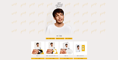
Rex Orange County:

Website Homepage. Rex is presented as mild-mannered and daydreaming.
Colour palette is light, bright, simple and easy on the eyes and the white
connotes purity and innocence.
Instagram Post thanking fans after the release of his
latest album "Pony"
Rex Orange County is also an artist who gets very emotional in his songs but in a different way to Capaldi (who's style is more gravelly and aggressive). His star persona and 'real' personality has less of a contrast, yet is still very effective. He is presented as a gentle and kind person, as seen through his wistful smile, looking off into the distance as if daydreaming. The white jumper is laid-back and casual, while also connoting innocence. This is his signature look for his album 'Pony', and synergises with his Instagram post, which is captioned with a personal and heartfelt message thanking his fans for their support over the years, which is signed "love from Alex", Rex's real name.

My pop artist will be called 'Vince', a stage name shortened from his full name 'Vincent Wan'. His music is energetic and vibrant, which will match with his colourful fashion sense and personality. He always wears a signature pair of pink aviator sunglasses, and his outfits are quite "retro". He is often seen hanging out with high-profile Hollywood celebrities and is close friends with Leonardo DiCaprio and, like Leo, is a passionate environmentalist and supporter of Earth Alliance, which DiCaprio co-founded.

Enigma is an effective way to generate interest, so Vince doesn't share much about his private life except through his songs and music videos (e.g. Grace Kelly is about a toxic relationship he's been in) and is rarely seen without his sunglasses, adding to the coding of mystery. Additionally, his socials would be minimalistic, usually just posting stills or promotion for projects he's working on, with a short, snappy caption.
A way for audiences to get to know Vince, however, would be through a Q and A feature on his official site, where fans can send in questions and every once in a while, Vince would answer some and post them publicly.
The initial moodboard for my star persona. Pastel/Retro colour
palette - bold, smart and stylish.
Flat plan for my star persona's signature
outfit
Flat plan for my star persona's secondary
outfit


Me 'before'
Me 'after' putting on the costume
Researching these two artists and creating my own has taught me a lot about how pop stars are packaged and presented to their audiences, particularly in relation to their music; whether their personality contrasts or amplifies it.

Blog Post 6: My Chosen Track

My chosen track for my music video is Grace Kelly by MIKA. Initially released as a single in 2007 through Island Records and Casablanca Records, it reached the top of the UK Singles Chart, propelling MIKA to success and garnering him critical acclaim. It became the first song on his debut album, Life In Cartoon Motion, released later that year.

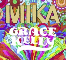
Grace Kelly(song).jpg
The Bright and colourful Single Cover

Interestingly, the song was written out of frustration after MIKA had a bad experience with a record label trying to change his sound to fit the common pop mould. MIKA rejected this suggestion and wrote the song to express his individuality, and in it he points out that he could pretend to be anyone he likes in order to win approval, but chooses not to in order to maintain integrity to his voice and art.

The music video is also an interesting case study, as it is quite in disjuncture with the lyrics and music. The song itself is bright, colourful and full of energy and "oomph", and the editing style matches this, with whip pans, fast transitions and quick dollies and zooms. However, the locations, costume and general mise-en-scene contrast with the song's colourful lyrics, being quite drab and run-down.
Still from the official music video


This is one of the reasons I chose this song, as I had quite a strong idea for an interpretation of it that contrasted greatly with the existing music video. I also chose it because MIKA's big personality and character really shone through and attracted me, and I enjoyed the challenge of pulling off that big character (albeit, again, my own interpretation of it) in my performance.

Blog Post 5: My Target Audience

Investigating the "fun-loving 16-25 year old" audience specified by the brief is important to my understanding of the market I am producing these products for, and will help in maximising their appeal.
To research my target audience, I conducted a survey which produced 31 responses from people within this age range.
Here it is clear that online and streaming services have taken 
over how people listen to music nowadays

My target audience gains escapist pleasures from the ability of music to allow them to escape into an atmosphere. It's also a powerful means of cheering them up and distracting them from their troubles. Pop is also often used to enhance social gatherings such as at parties, where my TA like to dance to the loud and pumping, upbeat tone of conventional pop

We can see here again the shift in the music industry - most of my TA don't spend money on their music anymore, rather they listen to it for free on YouTube (with the added value of a music video) or pay for music subscription services. It's also clear here that concerts and shows are a good source of revenue - no matter how advanced the internet becomes nothing can match the experience of a live concert seeing and hearing your favourite artists on stage in front of you and dancing along with a huge crowd of like-minded fans
Conducting this research has made me see the reasons why my TA engage with pop music, and what avenues of monetisation I should focus on. This will greatly influence my website design and choices around packaging and representation of star persona. I find it particularly interesting that my audience listens to music for escapism and creating an atmosphere, therefore I will bring those ideas to my music video, which I hope will have an atmospheric and colourful diegesis that will gratify those audience needs. In terms of listening habits and monetisation, my TA mainly listens through streaming services, so the link to the song on Spotify will be prominent on my website and promoted on social pages. In addition, I will push the buying of live tour tickets through promotions, a charity deal and a competition.