My Music Video

My Website

Friday, December 14, 2018

Blog Post 20: Closing Post

Dear Moderator,

I wish you a warm welcome to my Media AS NEA blog. On the right as well as at the bottom of this post, there is a label called "AS Research and Planning", in which you will find the 20 blog posts for my NEA.

Emmanuel Li (3113)

This blog is now closed.

Blog Post 19: My Finished Adverts

Here are my finished adverts:


Overall I am very happy and proud of both adverts. The process has been tough and stressful, but enjoyable and satisfying nonetheless. I had a great time working with the actors and crew and they have all messaged me saying they have enjoyed the experience too. The final adverts have the pace and snappiness I wanted them to have, and the humour is portrayed excellently by the actors. There are definitely some issues, such as inconsistent colour, awkward sound mix in places, and one continuity error, but I am happy that there are, for it is a learning experience and I shall keep these things in mind for future projects.

Blog Post 18: My Target Audience Feedback

I got feedback mainly through private messaging on social media. I messaged a few of my friends (aged 16-17) through Instagram, 2 male and 2 female, the day after the adverts were uploaded to Youtube.
The responses I got were largely positive, with many people commenting on how they liked the fast-paced editing, the acting, the camerawork and the humour. Some people felt the intertextuality should have been made clearer and a few people noted the inconsistent colour grading of Advert 2 (owing partly to the temperamental weather). It was also pointed out to me that there was a continuity error in Advert 2, where the YourFood logo on the cyclist's bag is not on the bag in the shot where he cycles across the screen.
Here is an example of a feedback session (with a 16 year old male):

In future, I will try and choose locations and times where weather conditions are more stable, and in post, I shall spend more time on colour grading to create a consistent look. I would also work more on sound mixing and pay greater attention to continuity.

Blog Post 17: My Adverts Review

Having a review copy meant that I could get feedback from my class and my teacher regarding any final post-production changes I could make.


After the review session and discussion with my classmates, I decided to make these final changes:
- Align the dubbing of dialogue and some of the voiceover differently in Advert 1
- In advert 2, change the colour grading so it is more consistent and brighter.

Blog Post 16: My Rough Cut

Making the rough cut gave me experience on location shooting with the actual camera equipment and editing together footage. It allowed me to decide which shots I'd like to keep and
which I'd like to reshoot.


Having made the rough cuts for both adverts, I had one more weekend to shoot if I wanted to make any changes, so I decided to reshoot the majority of Advert 2, with an altered script ("Sushi" instead of "Pizza" as the diet option) and better zombie makeup. I also decided to redo some shots of Advert 1 to experiment with different camerawork and framing.

Blog Post 15: My Shoot-Board

By making a shoot-board, it meant that my shoot days were structured and logical. Shots were organised into locations, so we get all the shots from one place, then move onto the next. I had to take into account actor availability as well. 
Advert 1 Shootboard Pg 1

Advert 1 Shootboard Pg 2

Advert 1 Shootboard Pg 3
---

Advert 2 Shootboard Pg 1

Advert 2 Shootboard Pg 2

Advert 2 Shootboard Pg 3

Having a shoot-board meant that when we were on location, we had a set order of shots to take and knew which shots we have taken and which shots we have yet to take.

Blog Post 14: My Kit List

Having a kit list was important as we were borrowing and sharing expensive equipment from school, so it was essential that we had something to check that everything was there and ready for shooting.


The kit list benefited our shooting experience as it allowed us to check and make sure that we had all the equipment with us when we are out on location, particularly when moving to different locations when equipment could easily be lost or left behind. Therefore we could focus on creativity and shooting rather than whether or not we are missing any kit.

Blog Post 13: My Time-Plan, Crew and Cast List

To put together a time plan, I had to make a lot of calls and texts to ensure actors were available at the right times and that the locations were available for use at those times.

The finished time plan and cast & crew list

Putting together a time plan meant that we were organised and knew who to expect at what time, and so we would know when to start packing up to move to the next location. As long as we kept to the time, we didn't need to hurry, hence reducing the risk of an accident or mistake.

Blog Post 12: My Location Reccie, Risk Assessment and Location Permissions


Doing a location reccie was essential, as I had to know the space I intend to film at, so I could plan where to place the tripod for the camera and how to block the actors. Having been at the location I'd also be aware of the risks and possible causes of complication, which I have listed clearly in a Risk Assessment, that I briefed all my actors and crew on at the beginning of a shoot. Getting signed permissions for the locations meant that we were respectful and polite to the owners of the houses we'd be filming at, letting them know who and at what times we will be there. The locations I used were:

Living Room, 24 Church Hill Road, Walthamstow
A large and fairly spacious living room, three sofas around a central coffee table, with a TV and fireplace on the far side and doorway on the near side leading to hallway. In order to make space for the camera, we would have to shift the coffee table further from the fireplace.

Kitchen, 24 Church Hill Road, Walthamstow
Separated by a small threshold to the dining room, where the camera can be placed looking into the kitchen. The main focus is the fridge on the left wall.

Hoe Street, Walthamstow
High street with a lot of independent restaurants and takeaways, place camera and tripod across the road - the pavement is narrow so care must be taken when filming.

Walthamstow Stadium
Famous Walthamstow location. Wide pavement and cycle path, usually a quiet street.

Back Garden, 110 Burnham Road, Chingford
Long garden with a stretch of grassy turf, where goals and a football will be placed.


The location reccie, risk assessment and permissions meant we were more organised and safe when on location.

Blog Post 11: My Practice Shoot/Edit

Shooting and editing together a practice/test version of the ads on my phone allowed me to see my adverts with live action visuals, blocking and camera movement and therefore helped me to decide whether or not I'd like to change anything, in case it didn't turn out how I planned it in the storyboard.


(Note: Due to the unavailability of cast members, I had to use finger puppets to represent the missing zombie characters)


After seeing these test shoots and discussing with the class and my teacher, I decided to implement the following changes:

Advert 1:
- Add shots at the end of the running sequence to connote that it was all in the protagonist's head.
- As a result of the above change, all the shots have to be pacier and snappier to fit the runtime.
- Have the protagonist run across all four shops instead of stopping for breath at the third shop.

Advert 2:
- Change the "diet" food to sushi instead of Pizza
- Change cast to all-male Sports Junkies (UK Tribes research)
- Make the gearing up montage more dynamic
- Add goals and a football to the mise-en-scene to connote backstory (playing football)

The practice shoot was beneficial to me as it gave me experience filming in the locations and working with the actors. Therefore for the main shoot, I can be more efficient with timings and confident in my directing.

Blog Post 10: My Advert Storyboards

Making storyboards for my adverts allowed me to plan my shot composition and camera movement in advance, meaning that during filming I can focus and spend more time on creativity and working with the actors rather than having to worry about how I will frame a shot.

Advert 1 Storyboard Page 1
Advert 1 Storyboard Page 2

Advert 1 Storyboard Page 3

---

Advert 2 Storyboard Page 1

Advert 2 Storyboard Page 2

Advert 2 Storyboard Page 3
Creating storyboards was beneficial to me as it gave me a graphic depiction of how both adverts would play out, thus it was easier to visualise and in the process of making them, I'd perhaps change transitions or shots that I thought didn't work. It also meant I could decide on a range of shots, angles and distances, as per the brief.

Blog Post 9: My Advert Timelines

Creating a timeline was useful as it forced me to use my imagination to think about exact timings for each shot so that the advert was exactly 30 seconds and thus fit the brief and is suitable to broadcast as a TV Spot.

This planning was beneficial to my project, as it provided an easy-to-follow basis for my storyboard. While making the timelines, I had to change or remove shots entirely in order to fit the runtime. Making these changes now meant that I wouldn't need to worry about it or waste time when creating more time consuming and detailed documents such as the storyboard or shootboard.

Blog Post 8: My Initial Proposal

I started off thinking of ideas for my adverts by first deciding on a USP. I settled on choice as the selling point and the main driver of both adverts, influenced by Just Eat's "Magic is Real" advert and its element of choice along a high street. I then came up with a slogan accordingly; I wanted something short and catchy and ended up "Your Food. Your Choice." I then decided I'd like both adverts to be intertextual with iconic British films, namely Trainspotting and Shaun of the Dead, the latter of which is directed by British director Edgar Wright; I took inspiration from the montage of a delivery driver gearing up in the "Just Eat Delivery Intro 2016", and included an Edgar Wright-esque montage in my advert, of my delivery cyclist as he gears up and goes. This intertextuality and generic hybridity would make my product appeal to fans of those films, who will gain satisfaction from noticing the intertextuality of the adverts. I also wanted the adverts to have a youthful and regional brand identity - adhering to the brief - so both feature teens and are set in North London, Walthamstow in particular. Each advert will be exactly 30 seconds in length and the content will be suitable for broadcast on Channel 4.

My Finished Initial Proposal
This benefited me, as having the initial proposal in this concise, simple format, I could easily tell what the story of both adverts are and imagine how they would play out. It also provided a framework for all the planning to come, and the simple format allowed for my peers to quickly get an idea of my adverts and thus they would be able to critique them.

Blog Post 7: Research Into Existing TV Commercials In Other Forms (e.g. Online, Print, Billboard)

This research further expanded my horizons on advertising, and by researching other forms of advertising, I got an idea of how big overarching aspects such as branding, logo and colour scheme are depicted, as well as more ideas on how representation is used.

London Buses
Certainly very in-your-face, but Chiquitita's London buses cleverly utilise advertising by making their logo and banana yellow to create a bright, colourful design or 'skin' for buses. This made me think about integrating my logo into different designs and the importance of finding a good colour scheme.

Fragrance Print Ads
A lot of male fragrance ads sell a similar idea - that if you wear this perfume, you will get ladies. Therefore there are often women in the focal image, looking longingly at the male, while they look straight into the camera, connoting their confidence and pride. Another ad shows a young man at a party surrounded by women, looking into the camera knowingly while he is enjoying himself.

Conducting this research has made me realise that a strong sense of colour is extremely helpful in branding and connoting brand values, something I will keep in mind when designing the logo. I also plan to subvert the trope of the alpha male at a party surrounded by women in one of my adverts. Instead, I plan to have a female protagonist looking into the camera while she mingles with her group of multicultural and mixed gender friends.


Sources Used:

-Google Images

Blog Post 6: Research Into Existing TV Commercials (Other Genres)

Researching existing TV commercials from genres other than food delivery gave me a broader understanding of TV advertising in general. I wanted to see what genre and representation techniques are effective for conveying certain messages, which in turn I might like to try in my own adverts. 


Car Adverts
Shots such as this are seen throughout many car commercials. Dynamic, low angle, tracking shots that show off the speed and power of the car.

McDonald's Adverts
Heartwarming stories big on emotional appeal. Stories often have a "slice of life" sensibility to them, swiftly establishing characters and backstory; characters that feel incomplete in some way; That is, until they go to McDonald's and subsequently form a bond - The message is clear: McDonald's brings people together.

Exploring these different techniques in storytelling has been very helpful in creating my own adverts. I figured I could use the dynamic editing and camerawork of car adverts to show the speedy delivery and the idea that food brings people together I felt was a strong emotional and relatable way to appeal to youth audiences.


Sources Used:

-YouTube

Wednesday, December 12, 2018

Blog Post 5: Research Into Existing TV Commercials For Take-Away Food Delivery Services

In researching existing food delivery services, I hoped to expand my knowledge on the codes and conventions of this particular genre of advertising and therefore, knowing what the audience expectations are, I can use or break these conventions in my own adverts. It also allowed me to develop and practise my analytical skills, so I had to think about things such as media language, connotations and representation.

I analysed a total of 10 adverts, which you can see in the embedded playlist:


From these, conventions I have noticed include:
-The brand's logo on backpacks, shirts, caps
-An intertitle at the end with the logo and a call-to-action asking you to download the app
-Humour, usually slapstick or absurdist (e.g. giant floating food in the city - Deliveroo)

In-Depth Analysis of One Advert - Just Eat "Magic is Real":

One advert that I analysed in detail is the "Magic Is Real" Just Eat advert. An entire song and jingle were composed for the advert, which is sung-through by the actors. The advert starts off in a domestic, relatable setting - a living room - showing someone ordering from the app, and then depicts a range of different cuisines of food from independent takeaways and restaurants along one high street in London - Myddleton Road - giving the advert a regional feel.

From this advert, I could tell that the brand values/USP is that ordering from Just Eat is like magic, food will 'appear' at your door with just a few taps of the app. There is on-screen text at the end saying "Download the app or order online now" and the colour palette is warm, vibrant and summery. Multicultural London is faithfully represented in this advert, where the range of cuisines shown allows for people from those cultures to be featured, and many ethnicities and even social groups (e.g. businessman in a suit, hipster in colourful clothes) are seen singing and dancing together. Therefore a strong sense of community spirit is instilled in this advert.

The advert is strongly intertextual with the musical film La La Land, as it borrows the editing and camera style of sweeping long takes or "oners" prevalent through the film. The song and music used is explosive and jazzy and the dancing is kinetic and synchronised, evoking the campy, fun 'Hollywood Musical' atmosphere of the film, but on a London high street, further reinforcing local appeal.

Conclusion
Researching these adverts were essential in inspiring me to come up with my own ideas for adverts. I used the element of choice along a high street in "Magic is Real" and made it my brand's USP ("YourFood. Your Choice.). I was also influenced by the action-adventure genre hybridity of the "Just Eat Delivery Intro 2016", where there was a montage of a delivery driver gearing up, and subsequently planned an Edgar Wright-esque montage of my delivery cyclist gearing up to go.


Sources Used:
-YouTube

Blog Post 4: The Target Audience (Males and Females Aged 16-25)

Researching the target audience is essential for any company, as you can use the information to tailor your product(s) to appeal to that audience, thus increasing business. My target audience according to the brief is age "16-25, mass market, male and female demographic in London". This also crosses over with Channel 4's target youth audience.

I conducted my research through a survey on Google Forms, sharing a link, which a total of 27 young people completed. Here are some results:
Fast Delivery and Local Support are both very high ranking,
as well as Easy-To-Use App. Therefore I intend to include all these
as selling points in my advert
The majority of the TA order from Just Eat.
Their adverts are usually quite over-the-top and humorous

Humour, Good Music and Visually Appealing are the top three
aspects. I shall try to include them all in my adverts.
This information can be used to decide
the best scheduling for my adverts
Conducting this survey has benefited me as I now have a good idea of what appeals to my target audience and what they value in an online food delivery service. This means I can select selling points and highlight them in my advert(s) according to this information, such as fast delivery and supporting local restaurants, as well as including humour making the adverts visually appealing.


Sources used:
-Google Forms

Blog Post 3: The ASA BCAP Code


My research into the ASA BCAP Code allowed me to gain an understanding of what was appropriate to be broadcast on TV and what wasn't, thus allowing me to carefully plan my adverts so they were appropriate.

"The UK Code of Broadcast Advertising (BCAP Code) applies to all advertisements (including teleshopping, content on self-promotional television channels, television text and interactive TV ads) and programme sponsorship credits on radio and television services licensed by Ofcom."
- From the ASA Website

There are a total of 31 Codes, 7 of which I picked out as relevant for this project:

1. Compliance
Adverts should not mislead or cause serious or widespread offence or harm, especially to children or the vulnerable.

2. Recognition of Advertising
Adverts must be obviously distinguishable from editorial content. The audience should quickly recognise the message as an advertisement.
Special care should be taken when using a format or elements in the advert that may lead to the audience believing it is not an advert e.g. NEWS FLASH.

3. Misleading Advertising
Adverts cannot give misleading information or omit important information that the consumer would need in order to make an informed decision about whether or not to buy a product or service.

4. Harm and Offence
Adverts must not be harmful or offensive. Advertisements must take account of generally accepted standards to minimise the risk of causing harm or serious or widespread offence against moral, social or cultural standards.

5. Children
Children must be protected from advertisements that could cause physical, mental or moral harm. A child is classified as someone under the age of 16.

6. Environmental Claims
Any environmental claims must have a clear basis. All terms used should be clear to consumers.

7. Food, Food Supplements and Associated Health or Nutrition Claims
Adverts must not feature, imply, condone or encourage irresponsible or immoderate drinking. That applies to both the amount of drink and the way drinking is portrayed.
Adverts must neither imply that alcohol can contribute to an individual's popularity or confidence nor imply that alcohol can enhance personal qualities.
Adverts must not imply that drinking alcohol is a key component of social success or acceptance or that refusal is a sign of weakness.

A Still from the #GiffGaffGuts Advert
An example of an advert that failed to uphold the code was the "#GiffGaffGuts" advert, which featured a large group of people in an empty swimming pool throwing blood and guts around. 15 complaints were received and as a result, the ad was upheld as it was "likely to cause revulsion or distress to viewers".

My research into the ASA BCAP Code has benefited me as I now know what I need to keep in mind when planning my adverts, so they both abide by the code and can, therefore, be broadcast.


Sources Used:
-ASA Website
-BCAP Code Document

Blog Post 2: Channel 4

My goal in researching Channel 4 is to understand the platform that my adverts will be broadcast on, particularly their values and target audience. Additionally, by researching the channel's programming I can decide when I'd like to schedule my ads and around which shows.
See the source image

Background
Channel 4 is a British public-service television broadcaster that began transmission on 2nd November 1982. It is owned by the Channel Four Television Corporation and is self-funded through commercials. There are many subsidiaries of Channel 4 which are more niche, such as Film4, 4Music and E4 (the main youth channel)

Brand Values
The public service remit for Channel 4 is the provision of a broad range of high quality and diverse programming. Channel 4 aims to:
  • Be innovative and distinctive
  • Stimulate public debate on contemporary issues
  • Reflect cultural diversity of the UK
  • Champion alternative points of view
  • Inspire change in people's lives
  • Nurture new and existing talent.

Programming
- Channel 4 is a publisher-broadcaster, so buys all of its programming from companies independent of itself.
- The Big Bang Theory is broadcast frequently on E4 from Monday to Friday, usually back-to-back around 5pm to 8:30pm, which is the time period that Channel 4 "holds" audiences for the longest, and from as early as 3pm on weekends.
See the source image- Channel 4 was the first to air Big Brother, which was a massive impact on the reality genre and TV in general
- Channel 4 often airs programs and ads with an alternative edge to them.
- Other popular programming includes The Simpsons, Hollyoaks, Brooklyn Nine-Nine, Friday Night Dinner, The Circle and Rude(ish) Tube, all programmes geared towards youth.
See the source image


By knowing the types of ads and programming Channel 4 broadcasts - more youth-oriented and 'edgier' content - I can use this information in planning my adverts so they would appeal to the typical Channel 4 audience. It also helps in deciding when to schedule my adverts so they could fit around shows which are watched by my target audience. As a result of my research into Channel 4 I have decided to schedule my adverts on Monday 8:30pm, Tuesday 6:40pm,  Wednesday 6:30pm, Thursday 6:30pm and Friday 7:30pm, between back-to-back episodes of The Big Bang Theory and Young Sheldon on E4.


Sources Used:
-Channel 4 Website
-Wikipedia

Blog Post 1: Existing Take-Away Food Delivery Services/Industry

By researching already existing take-away food delivery services, I was able to learn about my competition; what makes them successful, how they work and how I can use this information to create a successful brand of my own.

Online food delivery services are a relatively new and modern industry that's thriving, with £9.9 billion spent in 2017 on takeaway food. In addition, these services have created 41,000 new jobs, acting as a middle man between restaurants and their customers, providing delivery for places which don't traditionally deliver or have a delivery system in place. For example, you can order McDonald's on UberEats.

In my research I looked into two services in detail: Just Eat and Deliveroo (the top 2 best food delivery apps in the UK according to BusinessMatters), in particular their websites.

Just Eat
Founded by 5 Danish entrepreneurs in 2000 in Denmark, the company moved to the UK in 2000. In 2011, a joint venture was established in India. As of August 2018, Just Eat operates in 13 countries all across the globe. Their focus is on being informative and catering to a wider target audience. By sponsoring typically "British" things such as local football clubs, the company garners a regional feel, as well as loyalty from locals. For a restaurant to join Just Eat, they must have a license, and it costs £699 initially, with 13%-14% commission from orders. Just Eat currently have around 87,000 restaurant partners.


Upon opening the website, one would immediately notice the bright, bold colours in striking geometric shapes that are eye-catching and aesthetically pleasing. This colour scheme of red, green, blue and orange is consistent throughout all of Just Eat's adverts. The focal image is that of a pizza laid out on a table with various utensils and herbs around, certainly fitting with the "rustic charm" Just Eat has been praised for having. Overall, the website connotes a playful, exciting brand that provides good food and a great atmosphere.

In terms of how the service works, you enter your postcode and restaurants near that postcode come up, which you can then further filter with parameters such as cuisine, distance and ratings.

Star ratings are clearly displayed under each restaurant, as well as offers, delivery price, cuisine and the company logo. After picking a restaurant, it's a straightforward process of picking from the menu, paying for the order and choosing your preferred delivery time.

Deliveroo
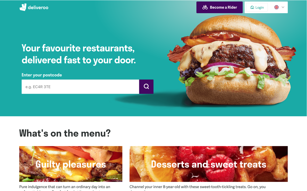
For comparison, I will briefly examine Deliveroo's website, to showcase a company that is also very successful, but caters for a slightly different audience.


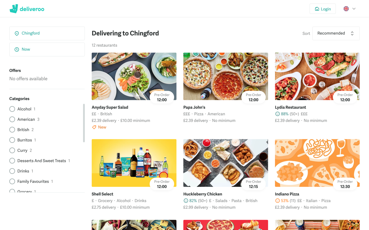
The website design is more minimalist and streamlined than Just Eat's, with a large focal image of a burger on a plain, minimalist colour background. Categories of food have also been created, with extreme close ups of food as the background bars and a title in a simple font.

The aesthetic is more "clean" and modern, with birds eye photos of laid-out food instead of company logos on the restaurant page. Deliveroo focuses more on providing delivery for upmarket or premium restaurants and takeaways.

This research has benefited me I learned about the history and growth of online food delivery services and what makes them so attractive to customers, in particular, the use of colour and design, and how this can inform the USP of a brand and establish its target audience. I also learned about the usefulness of creating a regional identity for a brand,so as to attract loyal local customers. By learning about how the whole process of ordering and delivery works, I can then depict that accurately in my adverts.

Sources Used:
-Just Eat Website
-Deliveroo Website
-Wikipedia
-Business Matters article
-LinkedIn article

Thursday, October 11, 2018

The Big Issue Cover Evaluation


WWW: I feel that I've captured the bold, bright colour design typical of BI covers, and thus is very eye-catching. The mast head is prominent, the focal image is large and fills up the space. The headline "Marvin Singer" is bold and easily readable.

EBI: Have more of a variation in topic of the inside stories other than just music and artists. Perhaps try out different colours and textures of text other than just white. Wear a different costume, one with brighter bolder colours so as to fit with the background more.

Tuesday, October 9, 2018

Continuity Task 2 Evaluation


My Role
I was involved in every aspect of production, such as script writing, story boarding, set dressing, producing, directing,camera operating and editing. In addition to this, I was also acting as character Jerome.

Factors We Took Into Account When Planning, Filming and Editing
In planning, we had to schedule our shoot in the lobby so it didn't clash with the other group. We needed to rehearse the blocking of the scene with the actors to make sure they walked, stopped, and sat at the same places and positions for the sake of continuity.
When filming, we tried to stick to these positions and actions so that the shots connected together to have a good narrative flow. We also had to take into account the space of the room, and where the camera could be placed so that the tripod could fit, and to avoid having the camera show up in reflective surfaces.
When editing, we knew from our brief that we couldn't use any additional music or audio-visuals, so we tried to use the silence or "atmos" of the room for comedic effect, showing the over-the-top tension between the characters.

How Successful?
I am very happy with the final product and believe that we fulfilled the demands of the brief. There were plenty of moments of match-on-action and we demonstrated shot-reverse-shot, all while sticking to the 180-degree rule. The story and character relationships were mostly told visually, with minimal dialogue. The story, while a bit silly and odd, makes logical sense and the characters are stereotypical but realistic. There was one discrepancy in continuity when the clock in the background of two shots showed a skip in time of ten minutes, when mere seconds had passed in the story. Additionally, the framing of Jerome's mid-shot (OTS of Ms. Perkins) could have been better.

What I Have Learnt
I've learnt to always be wary of the background and changes in it that can break continuity. I've learnt that it is important to spend time to ensure that framing and composition look good. For future tasks, I would be more aware of the aforementioned things, and would like to experiment more with creating visual comedy, as well as writing a good script.

Wednesday, October 3, 2018

Disney Trailer Analysis: The Incredibles 2


The trailer opens with a very familiar and relatable situation - the family dinner. As well as establishing the film's theme of family life mixing with superhero life, it appeals to family audiences (Disney 4-Quadrant Marketing Plan)and gives the audience a sense of the ordinary with only a dash (no pun intended) of superpowers, preparing them for the extraordinary things they are about to witness. The sibling rivalry in this scene provides comedy, and is again, very relatable, but with a superhero twist.

After setting up the family dynamic, the audience is shown a montage of the inciting incident and first act of the film, where Elastigirl is recruited to spearhead a publicity stunt to regain the public's trust in superheroes. This montage will appeal to female members of the audience, giving them a powerful (literally) action-hero role model. The rising cinematic action hits in the soundtrack reinforce the superhero genre, and create a triumphant atmosphere, perhaps suggestive of the sequel finally being released into theatres - the wait is over.

Immediately after this, the iconic Incredibles musical motif plays, while the institution information is displayed in an intertitle. The music speeds up, indicative of rising action, and we see the comical gender role reversal of the dad having to stay at home and take care of the kids while the mum is out working. The fast-paced and dramatic music here suggests another of the film's themes, that parenting is just as much of a heroic act as stopping supervillains.

Then, as the trailer reaches its climax, the music and editing pace building, while intertitles saying "It's time to get back... to being Incredible" would appeal to the nostalgia of general adult audiences and hardcore Disney fans, as they would remember the original film from their childhoods. The return of beloved characters Edna Mode and Lucius (Frozone) would also appeal to fans of the original.

The climax of the trailer is interrupted by an almost-fourth-wall-break, as the film's main villain, the Screen Slaver, hijacks the trailer. This creates intrigue and mystery, as the audience would want to find out more about this powerful new villain whose powers have leaked into the real world.

In my opinion, the trailer for The Incredibles 2 is highly successful in selling the film, as it appeals to a broad range of audiences, doesn't give away too much of the plot, and remains faithful to the original.

Monday, October 1, 2018

Continuity Task 1 Evaluation (6-Shot Accident)


The Story
Megan wants to cut out a dashing model from a magazine, so asks to borrow a pair of scissors that Hugo is playing with. He obliges and throws the scissors over to her, only for it to stab into her hand! She screams and Hugo reacts in horror.

How We Attempted to Achieve "Narrative Flow" (Continuity)
- We made sure to follow the 180-degree rule.
- The film opens with a wide establishing shot, which then moved closer in, to Mid Shots, then Close-Ups.
- Dialogue used to help to make the character's goal (to get the scissors) clear.
- Used a quick pan to "follow" the path of the scissors in the air, giving it a sense of speed and motion.

Did We Achieve Full Continuity?
Almost. Megan's position is slightly different when we cut from the wide to the mid shot, and there is a very jarring jump cut when we move into Hugo's mid close-up from the mid shot.

In Hindsight, What I Would Change/Improve
I would change Hugo's mid close-up to a big close-up of just his arm and the scissors, so the cut isn't as jarring. For that shot, I would also set it up on a tripod and whip pan out of it, so that it transitions seamlessly onto the next shot's whip pan into Megan's bloody hand.

Wednesday, September 26, 2018

Reflections on Practical: TV Drama Still - 'Western' Genre

The Cowboy Showdown
Planning
Our group really wanted to play around with interesting props, costume and locations, while staying realistic to our limitations. Therefore we ruled out Drama, High Fantasy and Adventure and were left to decide between the genres Heist or Western. Since I had a few items of Western-style clothing and I knew a friend who could lend us a few props, we decided to go with Western, as we thought it would be a challenging but fun genre to attempt. We knew we couldn't use the conventional iconography of the sprawling desert scenery of Westerns (since we didn't happen to have one handy in school), so we decided to focus more on indoor shots, such as stone staircases or wooden saloon interiors. We  opened a group chat where we sent photos and exchanged ideas of props and clothing that we could wear on the day, and I contacted my friend to borrow some props.

Analysis
We wanted to use as many genre conventions as possible in our shots, and in my shot above, we utilized the semic codes of the costumes (cowboy hat, leather waistcoat, jeans) as well as the props (the pistol), which are all signifiers of the Western genre. The shot is framed so that the cowboys are on opposite sides of the mise-en-scene, connoting their conflict, and the juxtaposition of the characters - we are focused on the cowboy in the foreground, who is a lot bigger than the other cowboy in the frame - suggests that we are following the foreground cowboy's point of view, or that he has more power in this situation.

Audience Interpretation
The high noon cowboy duel is a conventional narrative moment in Westerns, and following Barthe's action code, the audience can infer that only one cowboy will walk out of this scene alive. There is also enigma created as the audience wonders who these cowboys are, why they are having a duel, and what the stakes are.

What Was Succesful
I'm happy with how the costumes and props turned out - since we used actual items of clothing instead of cheap "cowboy costumes", and the pistol is also actually made of metal, so there is a good level of realism to the characters. I also think the framing was quite successful in connoting the power and conflict of the scene, especially the focus on the pistol.

What I Would Do Differently
If I had the chance to do it again, I would choose a different location, as the modern row of seating and clean-cut wood does spoil the realism a little bit, considering it's set in the American West in the 19th Century. I would also spend more time experimenting with angles and framing. Since the shot is supposed to be a tense, dramatic showdown I would especially like try out different ways of lighting the scene for more dramatic impact, since the shot at the moment seems a bit too evenly lit. I would experiment with low-key lighting; having the sun in the back so as to back-light the characters, creating silhouettes; or even go a bit abstract and use spotlights on the characters, to signify that in this moment, nothing else matters, they have zoned out of the world and are focused only on killing the other.

The Planning Storyboard

Tuesday, September 18, 2018

TV Drama Still Analysis: Breaking Bad

An iconic moment from the show
This still from Season 1 Episode 1 of the TV Drama Breaking Bad is extremely effective in connoting the show's main premise of an ordinary man turned bad, as well as its subgenres: 
Crime, Black Comedy, and Western.
The still is a long shot of Walter White, our protagonist, alone on a desert road with his back to us. 

He is not wearing any trousers.

Walt is also carrying a gun in his hand - a signifier of the Crime genre. His wide, ready stance combined with the sprawling desert scenery and use of shadows is highly suggestive of the Western genre - he looks like a cowboy preparing for a duel.
The most striking thing about Walt is the fact that we see his bare legs and underwear. This is a very comical image that, in addition to showing Walt as just an ordinary Joe in an extraordinary situation, it also signifies that we can expect the show to be darkly funny.

What can we learn from this? Well, this proves that a simple pair of tighty-whities can indeed successfully show both narrative and genre.
Good on you!